alinus
CASE STUDY
Idea
Mobile App of sports therapist Franz Leberbauer to track his patients' progress and help motivate them through gamification.
Services
Category
Client

Project Goal
Provide multiple design ideas to find the best fit.
Implement gamification elements to motivate patients.
Create a high-fidelity prototype.
Challenge
Provide an aesthetically pleasing and user-friendly interface with simple yet effective gamification elements.
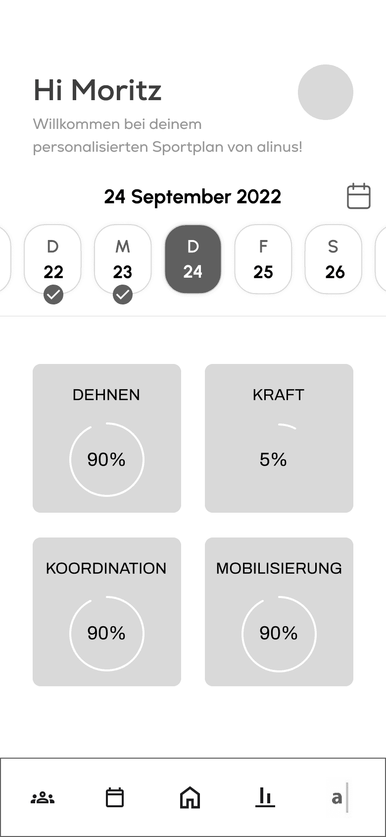
In the initial round, we presented several ideas on how to integrate gamification into the app and identified key areas to focus on. Some were converted into low-fidelity prototypes to facilitate better understanding. The ideas included:
Element
Progress indicator
Point system
Badges
Challenges
Gratulation
Leaderboard
Description
per training set, weekly
for each completed exercise, milestones…
for progress and milestones
-
A little celebration after
a training set
ranking of all users
Importance
very high
high
medium
low
medium
low
Implementation
easy
easy
medium
medium
easy
difficult
brainstorm
-
-
"Training on Christmas",
"8 weeks in a row"
"stretching saturday"
-
-
Decision
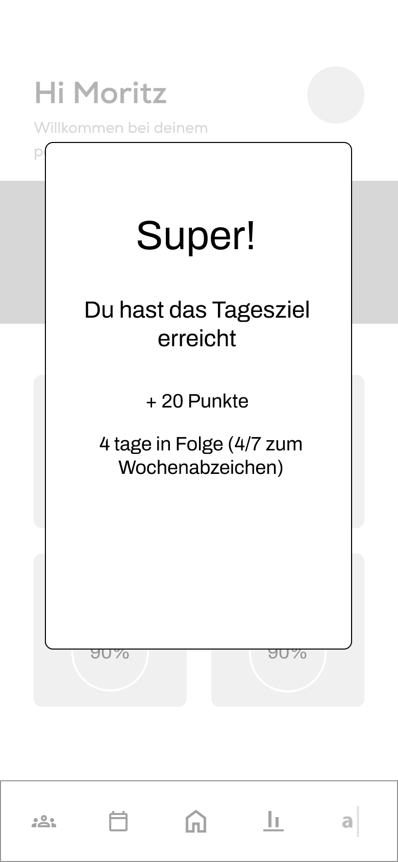
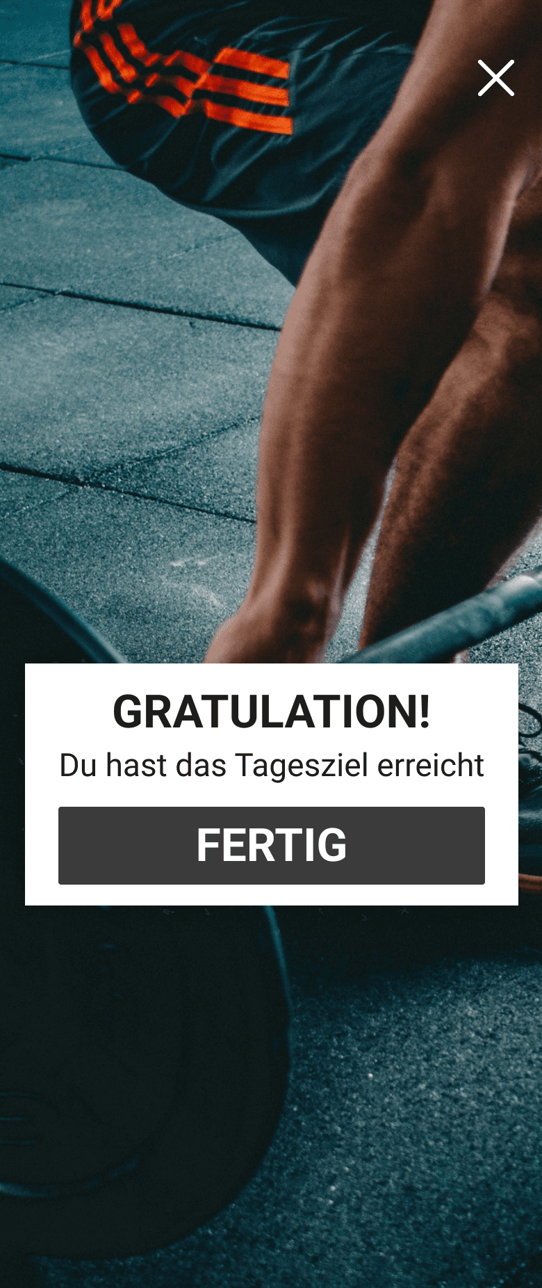
In collaboration with Franz Leberbauer, his team, and the programmers, we made the decision to include a progress bar and a congratulatory message after completing a training session. We also kept the option of incorporating points and badges for future implementation.
In the second round, we introduced two interface design concepts: one with a darker, modern aesthetic, and another with a lighter, serene design.
Light Design
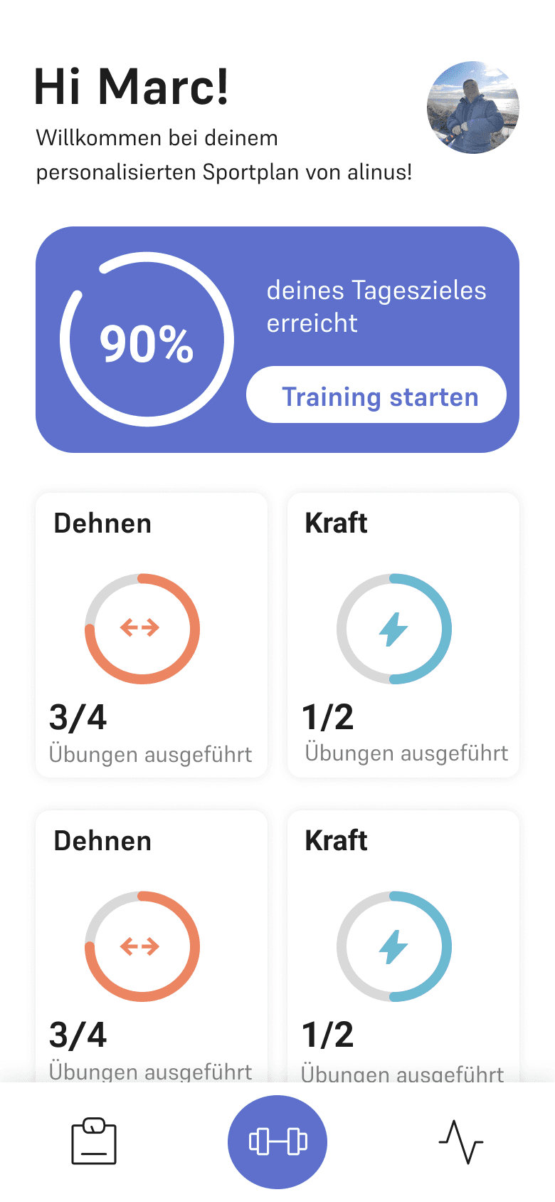
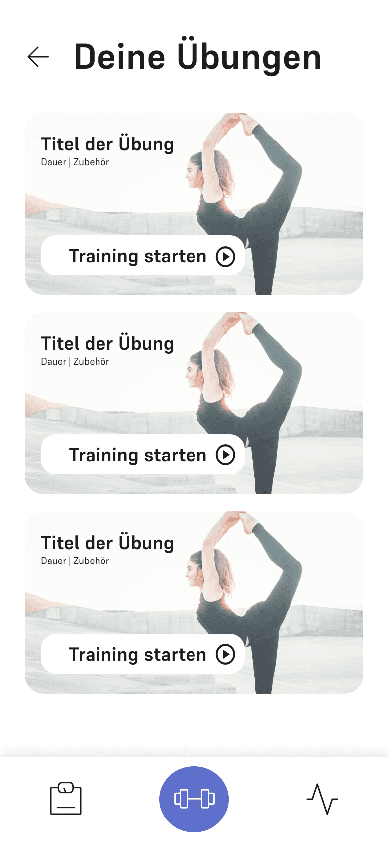
For the light design, we opted for a white background color and a grey palette for the structural elements. As for the accent colors, we chose matte tones. After careful consideration, we settled on the "Supreme" font for its readability and calming effect.
Font: supreme
Font weight: regular, bold
#1D1D1D
text primary
#FFFFFF
background,
text on colored background
#808080
text secondary
#D9D9D9
structure
#5E70CB
accent primary
#6BBAD1
accent secondary
#EC8562
accent secondary
Dark Design
For the dark design, we selected a dark, yet not black, background color and a vibrant turquoise as the accent color.
To complement the design, we opted for the "Roboto" font, which combines an edgy style with excellent readability.
Font: Roboto
Font weight: regular, bold
#1D1D1D
background, text on colored background
#ffffff
text primary
#406A74
buttons
#406A74
accent primary
Decision
We chose the dark design, taking into consideration the target audience of athletes who belong to the Gen Z and millennial age groups.
Final Design
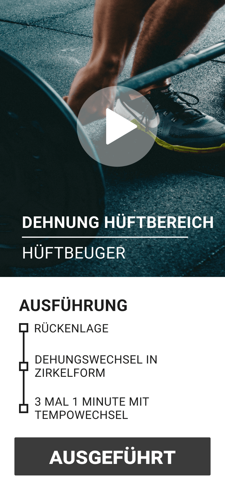
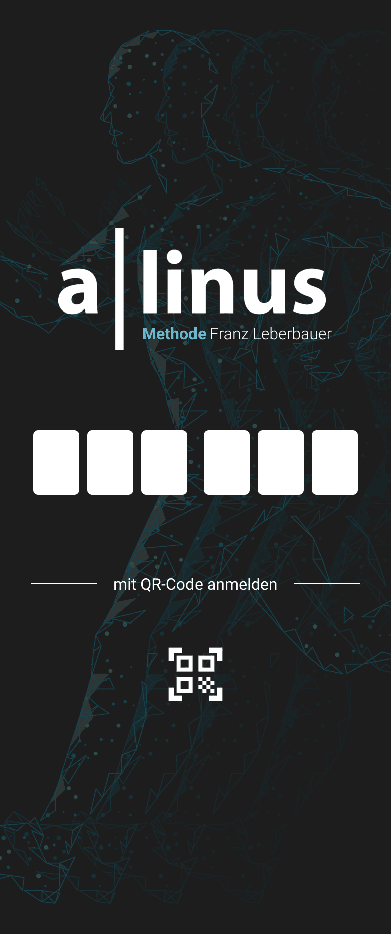
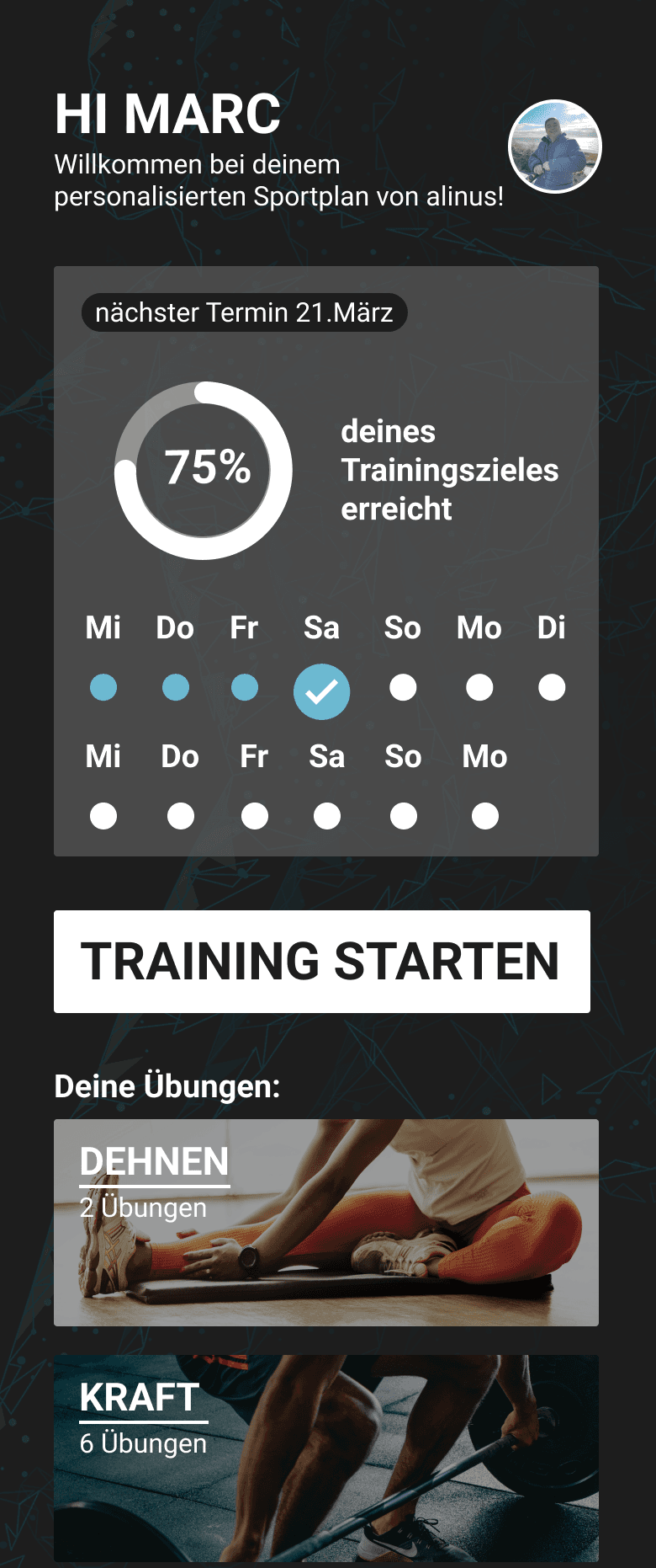
The final design we delivered to the programmers featured a progress section on the dashboard, allowing users to track their daily progress and view the countdown to their next appointment with Franz Leberbauer.


